Branding
Branding
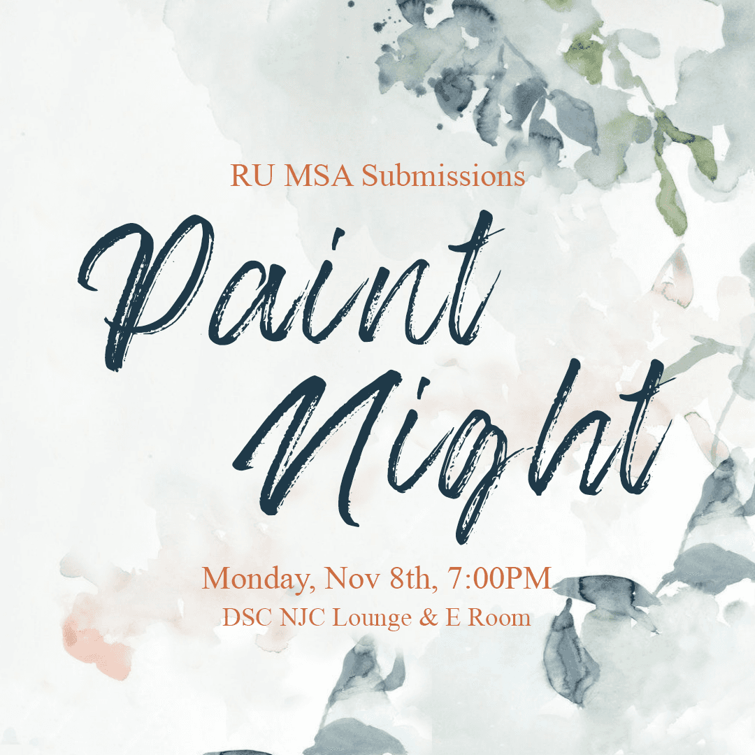
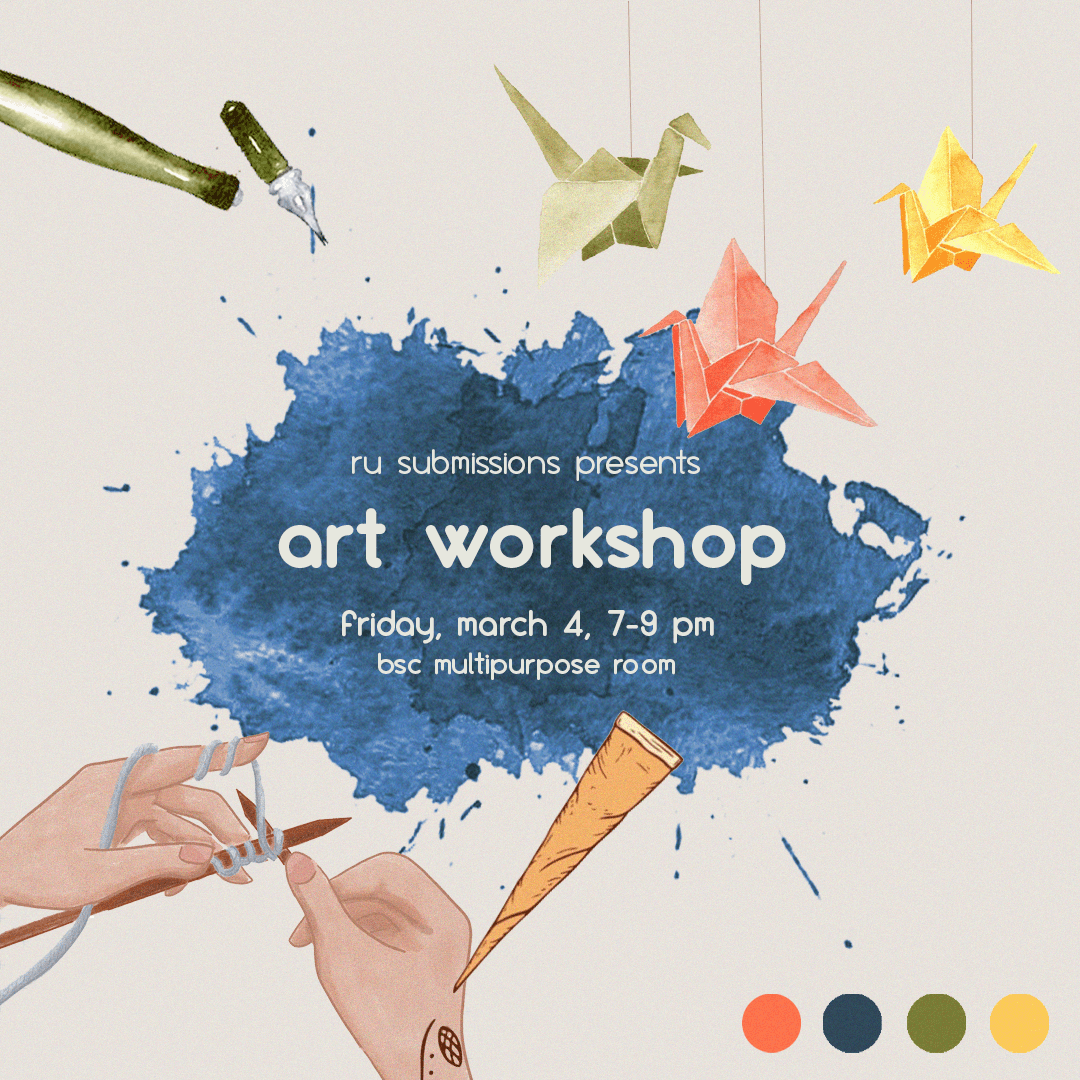
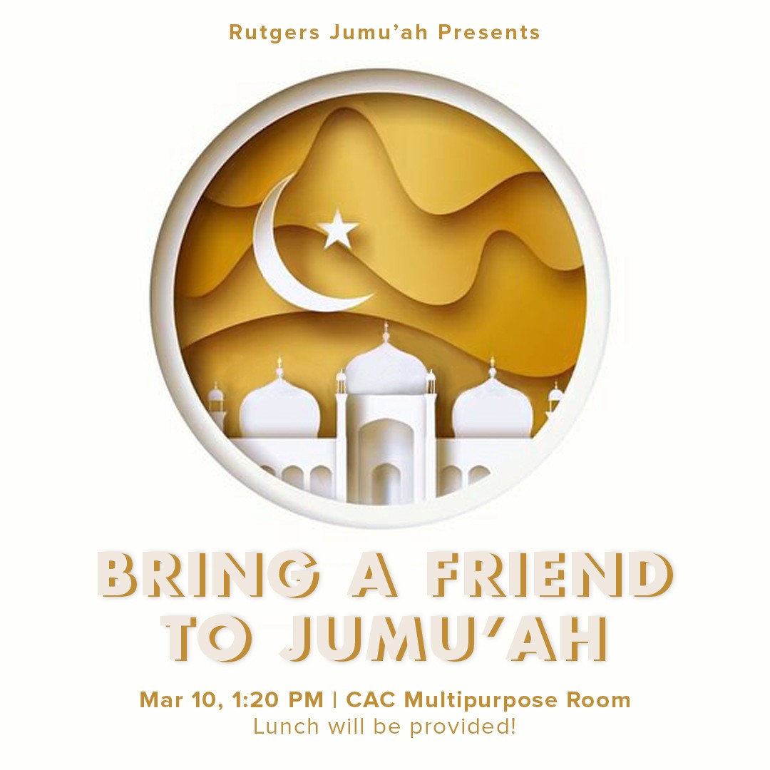
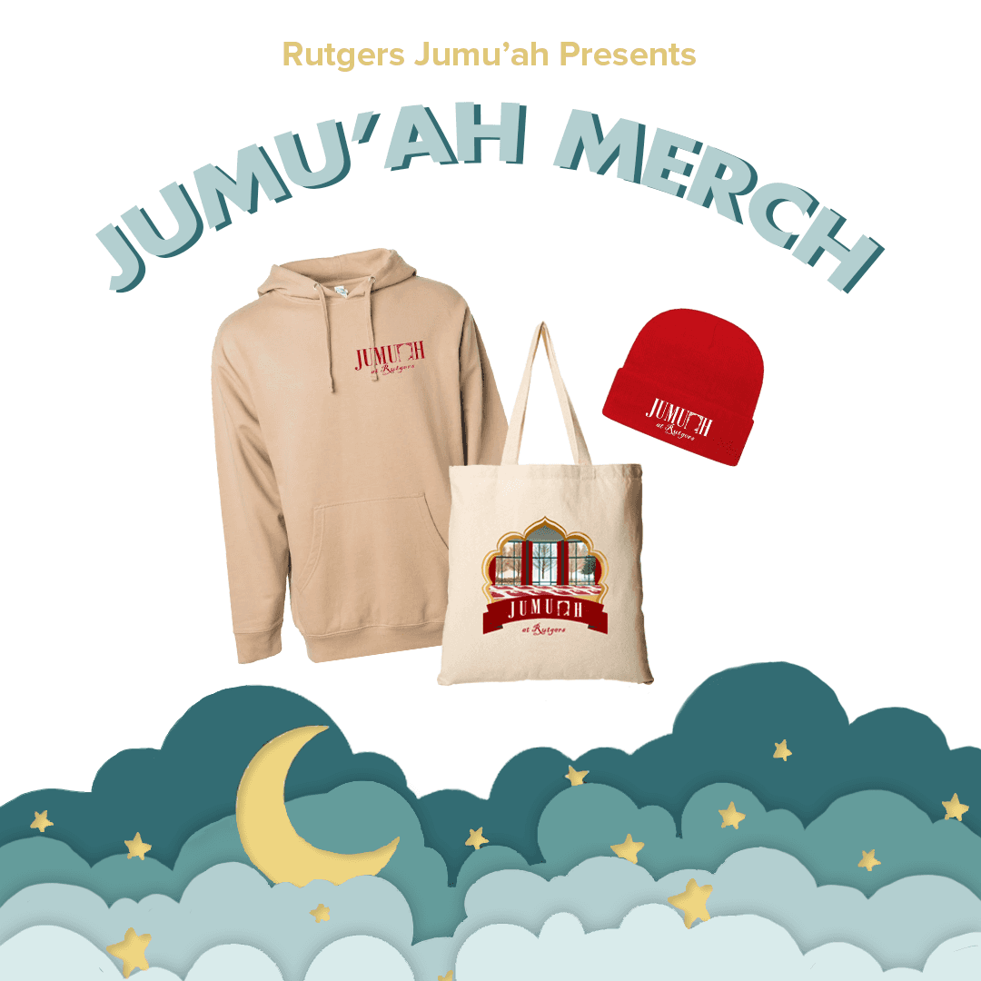
The Diversity Department at Rutgers University took a nuanced approach to branding. While university brand guidelines existed, we strategically adapted their application based on content type. For culturally significant content, especially social media posts, we prioritized authentic visual elements that honored religious and cultural traditions. However, for institutional programs and initiatives, we strictly adhered to Rutgers' brand guidelines to maintain professional cohesion. This flexible approach allowed us to balance institutional identity with cultural authenticity, ensuring our visual communication remained both respectful and effective.
The Diversity Department at Rutgers University took a nuanced approach to branding. While university brand guidelines existed, we strategically adapted their application based on content type. For culturally significant content, especially social media posts, we prioritized authentic visual elements that honored religious and cultural traditions. However, for institutional programs and initiatives, we strictly adhered to Rutgers' brand guidelines to maintain professional cohesion. This flexible approach allowed us to balance institutional identity with cultural authenticity, ensuring our visual communication remained both respectful and effective.
COLORS
COLORS
FONTS
FONTS
Clean, modern sans-serifs
(i.e. Open Sans and DM Sans)
Clean, modern sans-serifs
(i.e. Open Sans and DM Sans)
I designed a transcript layout for "Holding Space," the department's podcast focused on equity and progress conversations. The challenge was integrating multiple required elements - the Holding Space logo, Rutgers DEI logo, and bracket motifs while maintaining readability. To enhance visual interest, I incorporated a subtle dotted corner gradient and experimented with bracket positioning to achieve optimal balance. Using our brand typography and color palette, I created a minimalist design that drew attention while keeping the conversation text as the focal point.
TOOLS USED:


SHARED
SHARED
SHARED
SHARED
DIVERSITY
DIVERSITY
DIVERSITY
DIVERSITY
PRIORITIES
PRIORITIES
PRIORITIES
PRIORITIES
In preparation for the new year, the department launched "Shared Diversity Priorities," a strategic social media carousel initiative designed to highlight organizational diversity goals, demonstrate their importance, and document progress toward achieving them. Working within an established framework, I specialized in content refinement - crafting specific messaging for each slide and selecting impactful visuals that created a cohesive flow between frames while ensuring each image could stand independently. The carousel format allowed us to tell a more comprehensive story about our diversity initiatives while maintaining visual interest throughout the series.
TOOLS USED:

Building upon our established diversity priorities, we launched a collaborative social media carousel series showcasing how different departments were implementing these initiatives. I customized each slide with specific departmental achievements and progress, adapting the existing framework to highlight unique contributions while maintaining consistent branding. I developed targeted content and curated visuals that flowed seamlessly between frames while maintaining their individual impact, bringing each department's story to life within the established design. The series effectively demonstrated organization-wide progress toward our diversity goals, illustrating how various teams were turning priorities into tangible results.
TOOLS USED:


During the launch event for our department's Diversity Strategic Plan Phase 2, I contributed to the Diversity Progress Gallery by designing and composing informative posters that showcased various departmental initiatives. Working from provided content elements, I strategically arranged text and visual components to effectively highlight our collaborative diversity efforts and the progress made with key partners. These posters served as a visual testament to how our organization is transforming diversity goals into meaningful, tangible achievements.
TOOLS USED:


I refined the UEI impact report presentation, transforming a draft into a polished, engaging narrative. Using Pitch, I enhanced the visual communication through targeted design improvements, including indexing slides, introducing icons, color coding key text, and redesigning statistic slides. These interventions elevated the presentation into a compelling, professional storytelling tool that effectively communicated the organization's annual achievements.
TOOLS USED:


Women In
Women In
Women In
Women In
Leadership Series
Leadership Series
Leadership Series
Leadership Series
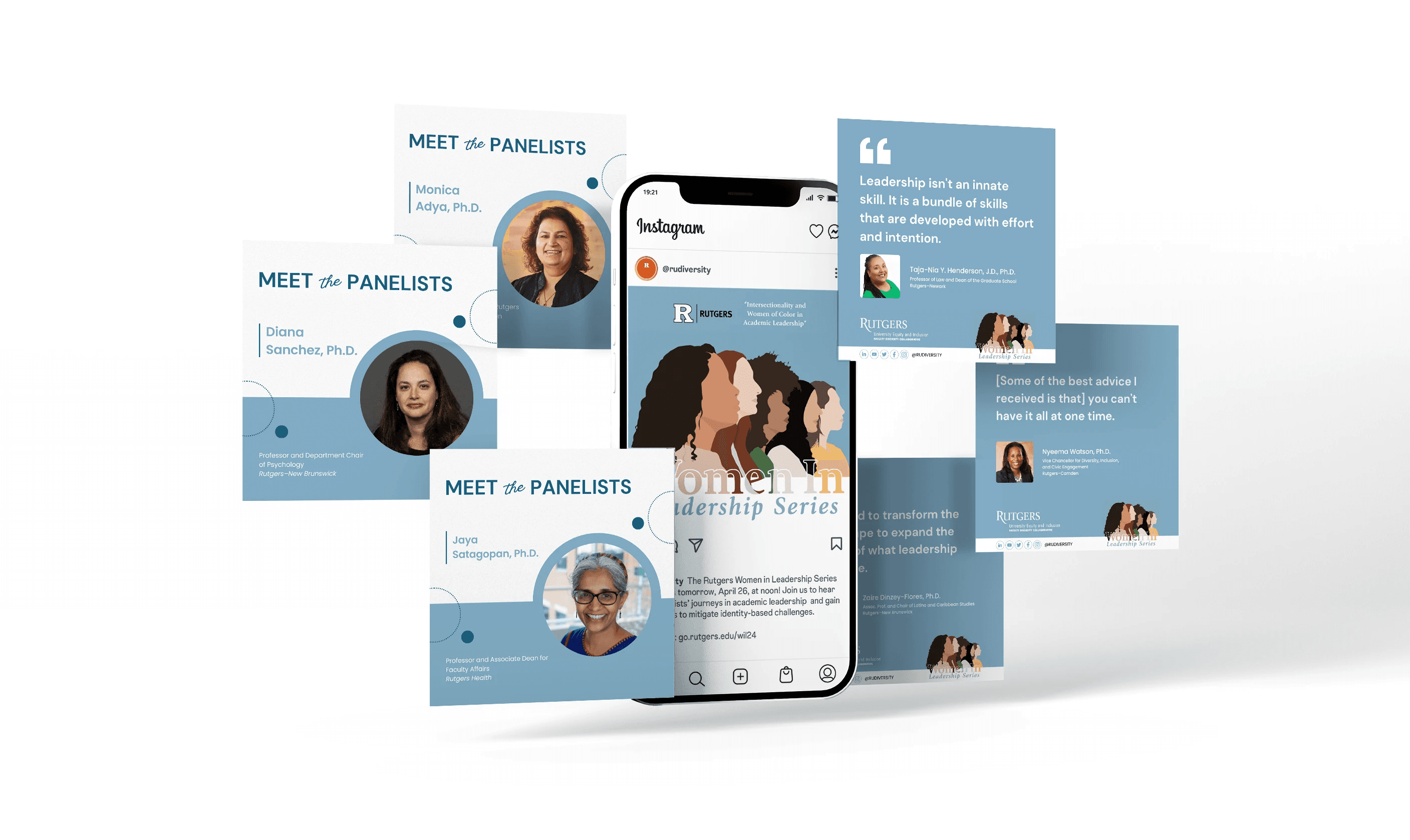
I developed the brand identity for the Rutgers Women in Leadership Workshop Series, a program offering skill-building workshops focused on advancing women faculty in academia. At the core of this identity was my original illustration featuring a diverse group of women, intentionally designed without eyes to emphasize broader features and emotional range. From this foundation, I created a comprehensive suite of branded materials, including Instagram post templates for upcoming workshops, moderator/speaker profiles, and quote highlights. The design system extended to workshop advertisements for the website and email banners, with careful attention to responsive scaling across platforms. The illustration and cohesive design system established a distinctive, memorable brand identity that resonated with the series' mission of empowering women in academic leadership.
TOOLS USED:


APIDA
APIDA
APIDA
APIDA
Heritage Month
Heritage Month
Heritage Month
Heritage Month
For APIDA Heritage Month, I designed an engaging infographic series featuring cultural facts, anchored by a watercolor lotus flower illustration - a symbol of deep significance in many Asian cultures. The design seamlessly integrated colors and typography drawn from the illustration's palette. To enhance visual continuity across the carousel slides, I incorporated connecting rectangular elements at the edges, creating a flowing narrative as viewers swiped through the facts. This thoughtful approach to both symbolism and design mechanics resulted in a cohesive and culturally resonant educational series.
TOOLS USED:


Native American
Heritage Month
Native American
Heritage Month
Native American
Heritage Month
Native American
Heritage Month
For Native American Heritage Month, I designed an infographic that balanced educational content with thoughtful visual elements. The design featured an intentionally restrained color palette of earthy tones, complementary typography, and minimalist line art illustrations. This purposefully simple approach enhanced the content's impact while maintaining cultural sensitivity, allowing the educational message to remain the primary focus.
TOOLS USED:


Day of Education
Day of Education
Day of Education
Day of Education
For International Day of Education, I designed a dynamic infographic series that wove together statistics, context, and thematic elements. Building from a central illustration, I thoughtfully integrated its visual motifs - including decorative flowers and dots - throughout the slides to maintain design coherence. The color palette and typography were carefully selected to complement the illustration, while subtle animations added an engaging layer of visual interest without overwhelming the educational content. This balanced approach created an informative yet visually compelling presentation of the day's significance.
TOOLS USED:


Discover
more work