Logo Redesign
Logo Redesign
Logo Redesign
Logo Redesign
The previous Submissions logo, an abstract green and yellow "S", failed to capture the organization's mission. Recognizing this disconnect, a redesign was initiated. After exploring numerous variations, we settled on a design that truly embodies the club's welcoming and
creative spirit.
Tools Used:
The previous Submissions logo, an abstract green and yellow "S", failed to capture the organization's mission. Recognizing this disconnect, a redesign was initiated. After exploring numerous variations, we settled on a design that truly embodies the club's welcoming and creative spirit.
Tools Used:


The new logo features:
⎯⎯
Soothing pastel colors that create a calm, inviting atmosphere
An illustration showcasing various art supplies, representing the club's diverse creative activities
A smooth, cursive font that unifies the design elements
Strategically placed stars that add a subtle glow, emphasizing the club's focus on nurturing creativity
Design Iterations
Design Iterations
I explored different approaches before reaching the final design. Each iteration helped me refine the concept while maintaining the core elements of creativity and community. Here are two key iterations from this process:
I explored different approaches before reaching the final design. Each iteration helped me refine the concept while maintaining the core elements of creativity and community. Here are two key iterations from this process:

Version 1
Version 1
Retro-inspired design featuring an oval frame and warm terracotta tones. The elongated shape and crossed art tools created a vintage badge aesthetic.
Retro-inspired design featuring an oval frame and warm terracotta tones. The elongated shape and crossed art tools created a vintage badge aesthetic.

Version 2
Version 2
Adapted to a circular format for better social media optimization. Softened the color palette to create a more calming feel while maintaining the core design elements.
Adapted to a circular format for better social media optimization. Softened the color palette to create a more calming feel while maintaining the core design elements.
In the final version, I refined the color harmony to achieve the perfect balance of professionalism and approachability. The muted palette and balanced composition better reflect the organization's welcoming spirit.
In the final version, I refined the color harmony to achieve the perfect balance of professionalism and approachability. The muted palette and balanced composition better reflect the organization's welcoming spirit.
Merch Designs
Merch Designs
Merch Designs
Merch Designs
Building on the new logo design, we expanded our brand presence by creating club merchandise, including a stylish windbreaker and a practical tote bag.
TOOLS USED:
Building on the new logo design, we expanded our brand presence by creating club merchandise, including a stylish windbreaker and a practical tote bag.
TOOLS USED:


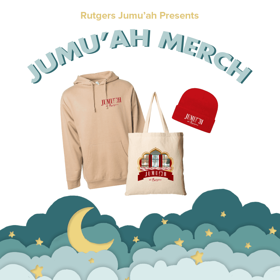
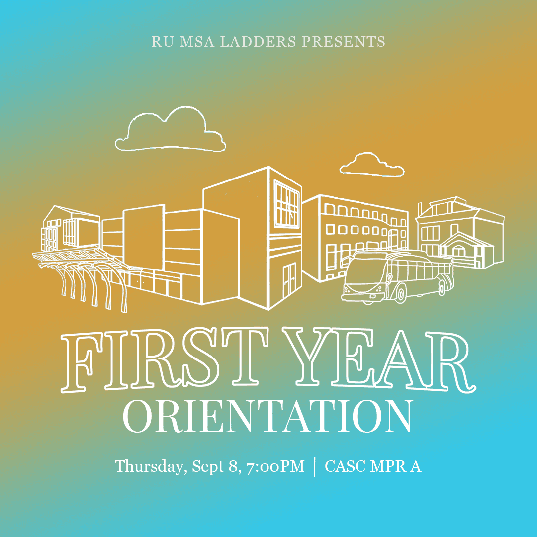
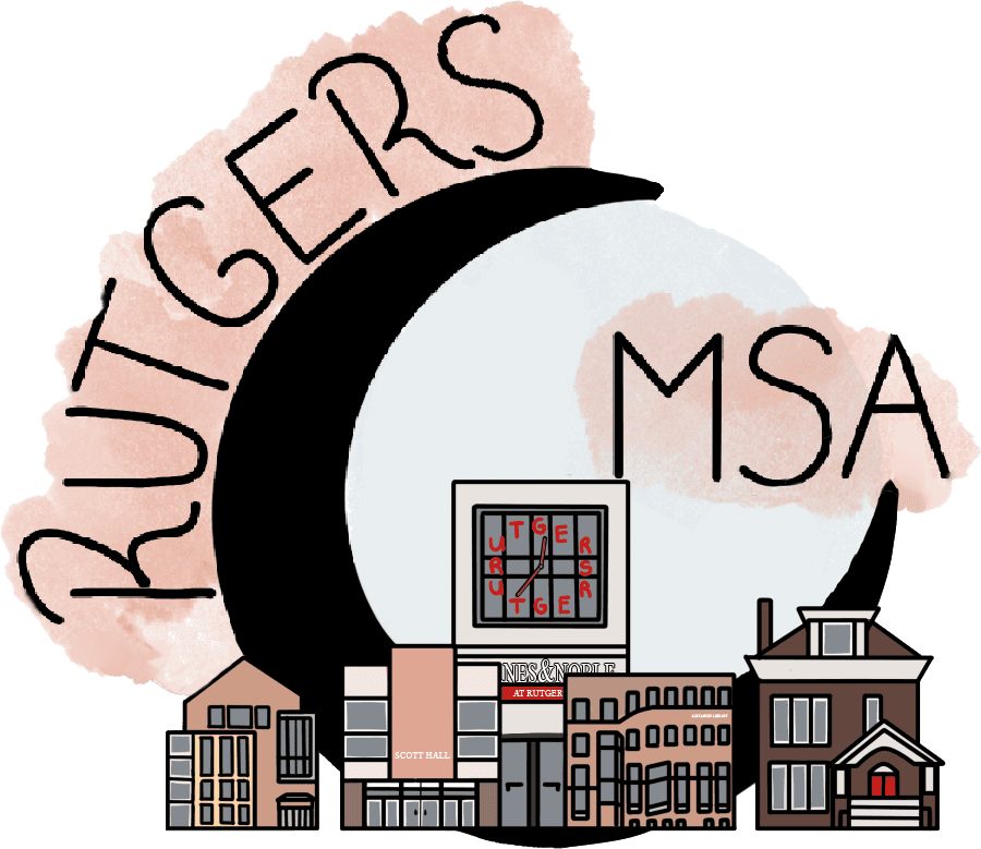
Beyond the Submissions merchandise, I was enlisted to assist with the broader MSA (Muslim Students Association) merchandise design. While the core concept was already established, I was tasked with addressing a sensitive issue: one of the buildings in the design resembled the Kaaba, which was not religiously appropriate.
Rather than simply modifying the problematic element, I took the initiative to reimagine the entire skyline. I incorporated iconic Rutgers buildings, creating a design that not only resolved the initial concern but also resonated more strongly with the university community. This approach resulted in merchandise that was both culturally respectful and distinctly representative of Rutgers.
*This project was completed under tight deadlines. I'm grateful to my talented cousin who provided valuable assistance with color selection, enabling us to meet the urgent request efficiently.*
*This project was completed under tight deadlines. I'm grateful to my talented cousin who provided valuable assistance with color selection, enabling us to meet the urgent request efficiently.*
Tools Used:
Tools Used:


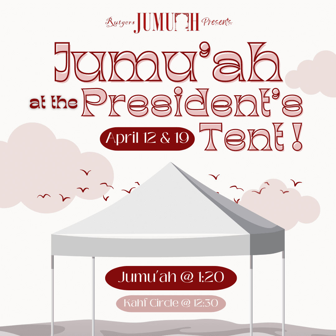
*For presentation purposes, the front design shown here has been reimagined to complement the back, though the actual product featured only text on the front.*
*For presentation purposes, the front design shown here has been reimagined to complement the back, though the actual product featured only text on the front.*
Events
Events
Events
Events
Submissions served as a dynamic platform for Muslim creatives, hosting several engaging events each semester. As the designer, I created comprehensive visual materials that brought each unique event to life.
Submissions served as a dynamic platform for Muslim creatives, hosting several engaging events each semester. As the designer, I created comprehensive visual materials that brought each unique event to life.

art
workshop
For a Submissions event focused on art-related skill sharing, I designed a cohesive set of Instagram posts and stories to boost engagement and attendance. To give potential attendees a clear preview, I incorporated visual representations of event activities such as henna, calligraphy, and origami into the designs. Although the event itself had no specific theme, I maintained a consistent color scheme across all materials to establish a strong brand identity. The vibrant, creative colors I selected were chosen to reflect the event's artistic atmosphere. My design choices aimed to capture the creative spirit of the gathering, provide instant visual cues about the event's content, and create a unified and appealing promotional campaign. This project showcased my ability to translate event concepts into engaging visual content, balancing informative elements with aesthetic appeal to drive interest and participation.


BOOK CLUB
BOOK CLUB
I designed two impactful social media posts to promote an event aimed at fostering literary discussions. The design strategy focused on creating visuals that captured the event's essence, inviting viewers into the world of literature and conversation. To showcase the event's offerings and enhance its welcoming atmosphere, I incorporated illustrations of pastries and tea. The color palette was carefully selected to evoke a cozy, intimate ambiance, encouraging participation and engagement. In terms of typography, I utilized three distinct fonts to represent and celebrate the diversity of writing styles welcomed at the event. This project demonstrates my ability to translate abstract concepts into visually appealing designs, effectively communicating the event's purpose and atmosphere through thoughtful illustration and typography choices. The result was a pair of promotional posts that not only advertised the event but also set the tone for the literary discussions to come, showcasing how targeted design can effectively convey an event's spirit even with limited promotional materials.
BOOK CLUB
BOOK CLUB
I designed two impactful social media posts to promote an event aimed at fostering literary discussions. The design strategy focused on creating visuals that captured the event's essence, inviting viewers into the world of literature and conversation. To showcase the event's offerings and enhance its welcoming atmosphere, I incorporated illustrations of pastries and tea. The color palette was carefully selected to evoke a cozy, intimate ambiance, encouraging participation and engagement. In terms of typography, I utilized three distinct fonts to represent and celebrate the diversity of writing styles welcomed at the event. This project demonstrates my ability to translate abstract concepts into visually appealing designs, effectively communicating the event's purpose and atmosphere through thoughtful illustration and typography choices. The result was a pair of promotional posts that not only advertised the event but also set the tone for the literary discussions to come, showcasing how targeted design can effectively convey an event's spirit even with limited promotional materials.


Paint Night
For a Submissions event combining painting and socializing, I designed an eye-catching Instagram post to drive attendance. The visual concept was carefully crafted to embody the event's creative spirit. I selected a vibrant color palette and dynamic background elements that evoke the energy and artistic atmosphere attendees could expect. To reinforce the painting theme, I chose fonts reminiscent of brushstrokes, creating a seamless blend between text and imagery. This thoughtful design approach not only advertised the event effectively but also gave potential participants a preview of the engaging, artistic experience awaiting them. The post successfully captured the essence of the event, showcasing my ability to distill a multifaceted social gathering into a single, compelling visual representation.
Paint Night
For a Submissions event combining painting and socializing, I designed an eye-catching Instagram post to drive attendance. The visual concept was carefully crafted to embody the event's creative spirit. I selected a vibrant color palette and dynamic background elements that evoke the energy and artistic atmosphere attendees could expect. To reinforce the painting theme, I chose fonts reminiscent of brushstrokes, creating a seamless blend between text and imagery. This thoughtful design approach not only advertised the event effectively but also gave potential participants a preview of the engaging, artistic experience awaiting them. The post successfully captured the essence of the event, showcasing my ability to distill a multifaceted social gathering into single, compelling visual representation.


For a Submissions event celebrating performance art, I developed a comprehensive visual package including promotional posts and event-day presentation slides. The design concept ingeniously blended a café theme with theatrical elements, reflecting the event's open mic night format. Drawing inspiration from classic blackboard menu aesthetics, I incorporated typography that emulated handwritten chalk lettering to enhance the café ambiance. The color palette was carefully curated to evoke both a cozy café setting and the rich, dramatic hues associated with theatre, creating a unique and fitting atmosphere for the performances. To reinforce the blackboard menu concept, I incorporated a chalky texture throughout the graphics. This textural element tied together the café theme while providing a perfect backdrop for the theatrical color scheme. The design seamlessly translated across various media, from social media posts to event slides, ensuring a cohesive visual experience. This project showcased my ability to develop a unified visual identity that not only effectively promoted the event but also enhanced the attendee experience. By thoughtfully interpreting and combining the café and theatre themes, I created a visual environment that complemented and elevated the artistic performances, demonstrating how strategic design can contribute to the overall success of an event while honoring its multifaceted nature.
For a Submissions event celebrating performance art, I developed a comprehensive visual package including promotional posts and event-day presentation slides. The design concept ingeniously blended a café theme with theatrical elements, reflecting the event's open mic night format. Drawing inspiration from classic blackboard menu aesthetics, I incorporated typography that emulated handwritten chalk lettering to enhance the café ambiance. The color palette was carefully curated to evoke both a cozy café setting and the rich, dramatic hues associated with theatre, creating a unique and fitting atmosphere for the performances. To reinforce the blackboard menu concept, I incorporated a chalky texture throughout the graphics. This textural element tied together the café theme while providing a perfect backdrop for the theatrical color scheme. The design seamlessly translated across various media, from social media posts to event slides, ensuring a cohesive visual experience. This project showcased my ability to develop a unified visual identity that not only effectively promoted the event but also enhanced the attendee experience. By thoughtfully interpreting and combining the café and theatre themes, I created a visual environment that complemented and elevated the artistic performances, demonstrating how strategic design can contribute to the overall success of an event while honoring its multifaceted nature.


Art Gala
For Submissions' ANNUAL charitable art auction event, I Created a cohesive suite of marketing materials centered around the lantern theme. This included a series of Instagram posts and presentation slide that maintained consistent branding through thoughtful typography, color schemes, and visual elements. While the initial post utilized an existing template due to time constraints, I developed subsequent materials by strategically adapting and expanding upon these design elements to create a unified visual narrative across all deliverables.
Art Gala
For Submissions' ANNUAL charitable art auction event, I Created a cohesive suite of marketing materials centered around the lantern theme. This included a series of Instagram posts and presentation slides that maintained consistent branding through thoughtful typography, color schemes, and visual elements. While the initial post utilized an existing template due to time constraints, I developed subsequent materials by strategically adapting and expanding upon these design elements to create a unified visual narrative across all deliverables.
Explore
Further
Explore
Further
Discover how user research and thoughtful interaction design shaped WadidSci’s digital presence through a responsive, accessibility focused website experience.
Discover how user research and thoughtful interaction design shaped WadidSci’s digital presence through a responsive, accessibility focused website experience.
View UX Case Study
View UX Case Study
View UX Case Study
View UX Case Study