Muslim
Mosaic
A website for Muslim Mosaic, a
magazine showcasing works of
Muslim artists and writers.
Role
Role
Role
Role
Interaction Designer
Interaction
Designer
Interaction Designer
Interaction Designer
Duration
Duration
Duration
Duration
10 Months
10 Months
10 Months
10 Months
Tools
Tools
Tools
Tools
Framer, Canva, Photoshop
Framer, Canva,
Photoshop
Framer, Canva, Photoshop
Framer, Canva, Photoshop
Overview
Overview
Overview
Overview
Muslim Mosaic is a digital magazine initiative that evolved from the Rutgers Muslim Students Association (MSA) Submissions club. Our goal was to transition from a low-traffic blog to an engaging digital magazine, showcasing works of Muslim artists and writers. This case study outlines the process of creating an interactive website to house the magazine and related content.
Muslim Mosaic is a digital magazine initiative that evolved from the Rutgers Muslim Students Association (MSA) Submissions club. Our goal was to transition from a low-traffic blog to an engaging digital magazine, showcasing works of Muslim artists and writers. This case study outlines the process of creating an interactive website to house the magazine and related content.
Muslim Mosaic is a digital magazine initiative that evolved from the Rutgers Muslim Students Association (MSA) Submissions club. Our goal was to transition from a low-traffic blog to an engaging digital magazine, showcasing works of Muslim artists and writers. This case study outlines the process of creating an interactive website to house the magazine and related content.
Muslim Mosaic is a digital magazine initiative that evolved from the Rutgers Muslim Students Association (MSA) Submissions club. Our goal was to transition from a low-traffic blog to an engaging digital magazine, showcasing works of Muslim artists and writers. This case study outlines the process of creating an interactive website to house the magazine and related content.
Problem
Problem
Problem
Problem
Muslim artists and readers experienced limited visibility and engagement on our basic blog platform. We needed to transform it into an interactive digital magazine that would better showcase creative work and provide users with intuitive access to submissions, contact forms, and subscription options—all on a limited budget.
Muslim artists and readers experienced limited visibility and engagement on our basic blog platform. We needed to transform it into an interactive digital magazine that would better showcase creative work and provide users with intuitive access to submissions, contact forms, and subscription options—all on a limited budget.
Muslim artists and readers experienced limited visibility and engagement on our basic blog platform. We needed to transform it into an interactive digital magazine that would better showcase creative work and provide users with intuitive access to submissions, contact forms, and subscription options—all on a limited budget.
Muslim artists and readers experienced limited visibility and engagement on our basic blog platform. We needed to transform it into an interactive digital magazine that would better showcase creative work and provide users with intuitive access to submissions, contact forms, and subscription options—all on a limited budget.
Solution
Solution
Solution
Solution
We created an interactive website where Muslim artists can effectively showcase their work and readers can easily engage with content. The platform delivers a magazine-like experience with intuitive navigation, streamlined submission forms, integrated mailing list for updates, and responsive design for seamless access across devices.
We created an interactive website where Muslim artists can effectively showcase their work and readers can easily engage with content. The platform delivers a magazine-like experience with intuitive navigation, streamlined submission forms, integrated mailing list for updates, and responsive design for seamless access across devices.
We created an interactive website where Muslim artists can effectively showcase their work and readers can easily engage with content. The platform delivers a magazine-like experience with intuitive navigation, streamlined submission forms, integrated mailing list for updates, and responsive design for seamless access across devices.
We created an interactive website where Muslim artists can effectively showcase their work and readers can easily engage with content. The platform delivers a magazine-like experience with intuitive navigation, streamlined submission forms, integrated mailing list for updates, and responsive design for seamless access across devices.
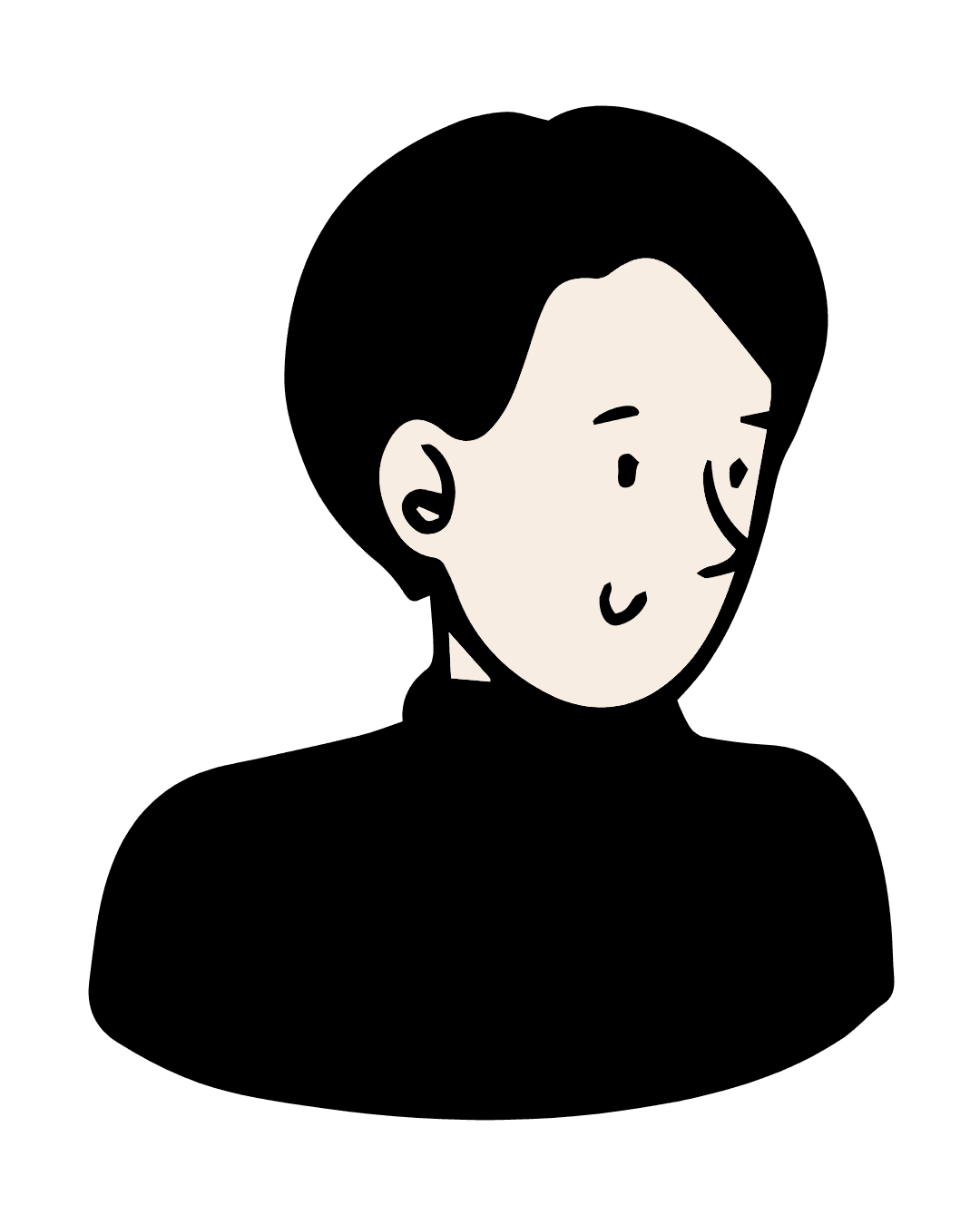
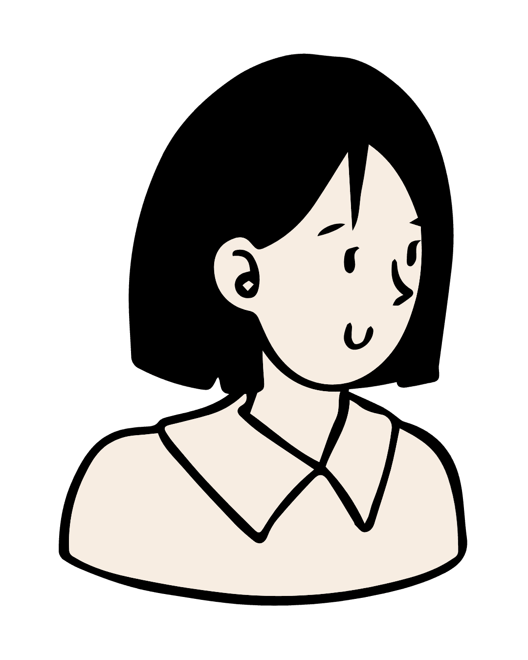
Our team consisted of three members: myself, Iqra Sajjad, serving as Club President and Interaction Designer; Nafia Naveed as Web Designer with a focus on visual design; and Juwairia Hassan as Editor-in-Chief and Content Writer.
Scope &
Constraints
Scope &
Constraints
Scope &
Constraints
Scope &
Constraints
Our scope included developing a responsive website accessible across various devices, creating an interactive digital version of the magazine, and implementing a call for submissions feature. We also designed a contact form for inquiries, set up a subscription system for updates, and developed special initiative pages such as the Ramadan Series. Additional key components included the Archives page to showcase past editions, a Featured Creators section to highlight contributors, a Join Our Community section to encourage ongoing engagement, and a social sharing feature on each magazine edition page to support contributor visibility and outreach.
We operated under significant constraints, including a limited budget due to being a small club, a small team with members taking on multiple roles, and time constraints balancing club responsibilities and website development.
Our team consisted of three members: myself, Iqra Sajjad, serving as Club President and Interaction Designer; Nafia Naveed as Web Designer with a focus on visual design; and Juwairia Hassan as Editor-in-Chief and Content Writer.
Our scope included developing a responsive website accessible across various devices, creating an interactive digital version of the magazine, and implementing a call for submissions feature. We also designed a contact form for inquiries, set up a subscription system for updates, and developed special initiative pages such as the Ramadan Series. Additional key components included the Archives page to showcase past editions, a Featured Creators section to highlight contributors, a Join Our Community section to encourage ongoing engagement, and a social sharing feature on each magazine edition page to support contributor visibility and outreach.
We operated under significant constraints, including a limited budget due to being a small club, a small team with members taking on multiple roles, and time constraints balancing club responsibilities and website development.
Our team consisted of three members: myself, Iqra Sajjad, serving as Club President and Interaction Designer; Nafia Naveed as Web Designer with a focus on visual design; and Juwairia Hassan as Editor-in-Chief and Content Writer.
Process
Process
Process
Process

User Research
User Research
User Research
User Research
We began with comprehensive user research to guide our interaction design decisions. This included analyzing responses from a feedback form shared with blog readers, which revealed pain points such as confusing navigation, slow load times, and limited engagement on long-form content. These insights directly influenced how we structured the site and prioritized interaction patterns.
We also examined high-performing magazine and interactive websites to identify best practices in navigation, animation timing, and content hierarchy. I focused specifically on how microinteractions, visual feedback, and scroll-based animations could enhance usability without overwhelming users.
Key statistics supported our design direction:
83%
83%
83%
83%
value seamless multi-device experiences
value seamless multi-
device experiences
value seamless multi-device experiences
value seamless multi-device experiences
3 secs
3 secs
3 secs
3 secs
is how long users will wait for a site to load
is how long users will
wait for a site to load
is how long users will wait for a site to load
is how long users will wait for a site to load
Eye-Tracking Research
Eye-
Tracking
Research
Eye-Tracking Research
Eye-Tracking Research
Jakob Nielsen
Jakob Nielsen
Jakob Nielsen
Jakob Nielsen
While users initially focus above the fold, they will scroll when guided by visual cues and animation.
While users initially focus
above the fold, they will scroll
when guided by visual cues
and animation.
While users initially focus above the fold, they will scroll when guided by visual cues and animation.
While users initially focus above the fold, they will scroll when guided by visual cues and animation.
Overall, this research helped shape a balance between functional interactivity and visual storytelling. It ensured that every interactive element—from hover animations to scroll-reactive features—was intentional, lightweight, and designed to keep users engaged while guiding them smoothly through the experience
Overall, this research helped shape a balance between functional interactivity and visual storytelling. It ensured that every interactive element—from hover animations to scroll-reactive features—was intentional, lightweight, and designed to keep users engaged while guiding them smoothly through the experience
Overall, this research helped shape a balance between functional interactivity and visual storytelling. It ensured that every interactive element—from hover animations to scroll-reactive features—was intentional, lightweight, and designed to keep users engaged while guiding them smoothly through the experience
Overall, this research helped shape a balance between functional interactivity and visual storytelling. It ensured that every interactive element—from hover animations to scroll-reactive features—was intentional, lightweight, and designed to keep users engaged while guiding them smoothly through the experience
Analysis
Analysis
Analysis
Analysis
After completing our research, we moved into the analysis phase to distill our findings into actionable design strategies. I developed detailed user personas to represent the diverse audience of Muslim Mosaic—ranging from young artists seeking exposure to readers interested in Muslim creativity. These personas helped us empathize with user goals, frustrations, and device preferences.
After completing our research, we moved into the analysis phase to distill our findings into actionable design strategies. I developed detailed user personas to represent the diverse audience of Muslim Mosaic—ranging from young artists seeking exposure to readers interested in Muslim creativity. These personas helped us empathize with user goals, frustrations, and device preferences.
After completing our research, we moved into the analysis phase to distill our findings into actionable design strategies. I developed detailed user personas to represent the diverse audience of Muslim Mosaic—ranging from young artists seeking exposure to readers interested in Muslim creativity. These personas helped us empathize with user goals, frustrations, and device preferences.
After completing our research, we moved into the analysis phase to distill our findings into actionable design strategies. I developed detailed user personas to represent the diverse audience of Muslim Mosaic—ranging from young artists seeking exposure to readers interested in Muslim creativity. These personas helped us empathize with user goals, frustrations, and device preferences.
User Personas
User Personas
User Personas
User Personas

The
Aspiring
Creator
Age: 20
Major: B.A. in Graphic Design
Medium: Digital Art and Photography
Wants to build her portfolio and reach a wider audience. Looks for submission platforms that highlight visual work. Needs a clean, easy-to-use submission process with visual focus. Browses and shares content mostly on mobile.
Aspiring
Creator
Click to flip
The Small
Business
Owner
Age: 24
Major: B.A. in Marketing
Medium: Food Photography and Reflections
Uses storytelling to promote his home baking business. Wants visibility without feeling too promotional. Needs clear submission guidelines and contributor bios. Uses laptop for submissions, mobile for browsing/sharing.
Small Business
Owner
Click to flip
The
Reflective
Writer
Age: 24
Major: B.A. in English Lit.
Medium: Essays & Personal Reflections
Wants an outlet to express thoughts on faith and identity. Feels vulnerable sharing personal writing publicly. Needs a welcoming tone and examples of similar submissions. Writes on laptop, reads on both desktop and mobile.
Reflective
Writer
Click to flip

The
Casual
Reader
Age: 25
Major: M.S. in Healthcare Admin.
Medium: Reader / Creative Explorer
Browses the magazine for inspiration and to support friends. Likes smooth, visual storytelling and modern design. Needs fast-loading archives and an intuitive reading experience. Primarily reads on mobile, occasionally on desktop.
Casual
Reader
Click to flip
The
Aspiring
Creator
Age: 20
Major: B.A. in Graphic Design
Medium: Digital Art and Photography
Wants to build her portfolio and reach a wider audience. Looks for submission platforms that highlight visual work. Needs a clean, easy-to-use submission process with visual focus. Browses and shares content mostly on mobile.
Aspiring
Creator
Click to flip
The Small
Business
Owner
Age: 24
Major: B.A. in Marketing
Medium: Food Photography and Reflections
Uses storytelling to promote his home baking business. Wants visibility without feeling too promotional. Needs clear submission guidelines and contributor bios. Uses laptop for submissions, mobile for browsing/sharing.
Small Business
Owner
Click to flip
The
Reflective
Writer
Age: 22
Major: B.A. in English Lit.
Medium: Essays & Personal Reflections
Wants an outlet to express thoughts on faith and identity. Feels vulnerable sharing personal writing publicly. Needs a welcoming tone and examples of similar submissions. Writes on laptop, reads on both desktop and mobile.
Reflective
Writer
Click to flip
The
Casual
Reader
Age: 25
Major: M.S. in Healthcare Admin.
Medium: Reader/ Creative Explorer
Browses the magazine for inspiration and to support friends. Likes smooth, visual storytelling and modern design. Needs fast-loading archives and an intuitive reading experience. Primarily reads on mobile, occasionally on desktop.
Casual
Reader
Click to flip
The
Casual
Reader
Age: 25
Major: M.S. in Healthcare Admin.
Medium: Reader/ Creative Explorer
Browses the magazine for inspiration and to support friends. Likes smooth, visual storytelling and modern design. Needs fast-loading archives and an intuitive reading experience. Primarily reads on mobile, occasionally on desktop.
Casual
Reader
Click to flip
Pain Points
Pain Points
Pain Points
Pain Points
Vulnerability
Vulnerability
Vulnerability
Vulnerability
Validation
Validation
Validation
Validation
Trust
Trust
Trust
Trust
Consistency
Consistency
Consistency
Consistency
Submission
Submission
Submission
Submission
Visibility
Visibility
Visibility
Visibility
Clarity
Clarity
Clarity
Clarity
Exposure
Exposure
Exposure
Exposure
Navigation
Navigation
Navigation
Navigation
Engagement
Engagement
Engagement
Engagement
Friction
Friction
Friction
Friction
Recognition
Recognition
Recognition
Recognition
support
support
support
support
Inspiration
Inspiration
Inspiration
Inspiration
Vulnerability
Vulnerability
Vulnerability
Vulnerability
Validation
Validation
Validation
Validation
Trust
Trust
Trust
Trust
Consistency
Consistency
Consistency
Consistency
Stage
Discover
Explore
Engage
Convert
Reflect
Action
Sees a call for submissions on IG
Browses past magazine issues
Reads submission guidelines
Submits photography via form
Shares her featured piece
Emotions
& Thoughts


Opportunities
Clear CTA with visual cues on homepage
Intuitive archive access
Simplified steps, clear formatting expectations
Visual confirmation and "Thank you" animation
Engage through sharing and creator highlights
User Journey Map for 'The Lab Manager' Persona
User Journey Map for 'The Aspiring Creator' Persona
User Journey Map for 'The Aspiring Creator' Persona
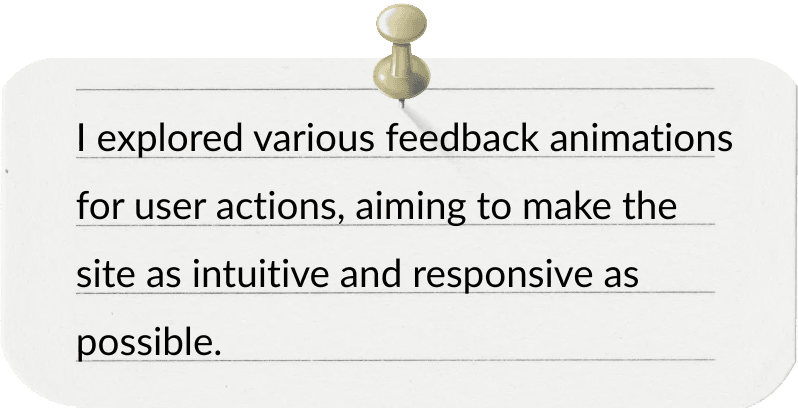
I then mapped out user journeys to identify critical touchpoints and determine where interactive elements could enhance clarity, engagement, and flow. For example, knowing that mobile responsiveness was a priority for users accessing content on the go, I emphasized touch-optimized interactions and simplified navigation. I also considered visual feedback for actions like form submissions and CTA hovers to ensure the interface felt intuitive and responsive.
I then mapped out user journeys to identify critical touchpoints and determine where interactive elements could enhance clarity, engagement, and flow. For example, knowing that mobile responsiveness was a priority for users accessing content on the go, I emphasized touch-optimized interactions and simplified navigation. I also considered visual feedback for actions like form submissions and CTA hovers to ensure the interface felt intuitive and responsive.
I then mapped out user journeys to identify critical touchpoints and determine where interactive elements could enhance clarity, engagement, and flow. For example, knowing that mobile responsiveness was a priority for users accessing content on the go, I emphasized touch-optimized interactions and simplified navigation. I also considered visual feedback for actions like form submissions and CTA hovers to ensure the interface felt intuitive and responsive.
I then mapped out user journeys to identify critical touchpoints and determine where interactive elements could enhance clarity, engagement, and flow. For example, knowing that mobile responsiveness was a priority for users accessing content on the go, I emphasized touch-optimized interactions and simplified navigation. I also considered visual feedback for actions like form submissions and CTA hovers to ensure the interface felt intuitive and responsive.

User Journey Map for 'The Aspiring Creator' Persona
User Journey Map for 'The Aspiring Creator' Persona
This analysis phase was crucial in defining which interactions would support user goals—like exploring magazine issues or submitting work—and which might distract or create friction. These insights guided every animation, scroll behavior, and feedback mechanism we built into the final experience.
This analysis phase was crucial in defining which interactions would support user goals—like exploring magazine issues or submitting work—and which might distract or create friction. These insights guided every animation, scroll behavior, and feedback mechanism we built into the final experience.
This analysis phase was crucial in defining which interactions would support user goals—like exploring magazine issues or submitting work—and which might distract or create friction. These insights guided every animation, scroll behavior, and feedback mechanism we built into the final experience.
This analysis phase was crucial in defining which interactions would support user goals—like exploring magazine issues or submitting work—and which might distract or create friction. These insights guided every animation, scroll behavior, and feedback mechanism we built into the final experience.
Ideation
Ideation
Ideation
Ideation
In the ideation phase, I let my creativity flow, brainstorming a wide range of interactive elements that could make the website more engaging.
In the ideation phase, I let my creativity flow, brainstorming a wide range of interactive elements that could make the website more engaging.
In the ideation phase, I let my creativity flow, brainstorming a wide range of interactive elements that could make the website more engaging.
In the ideation phase, I let my creativity flow, brainstorming a wide range of interactive elements that could make the website more engaging.
DRAG TO MOVE
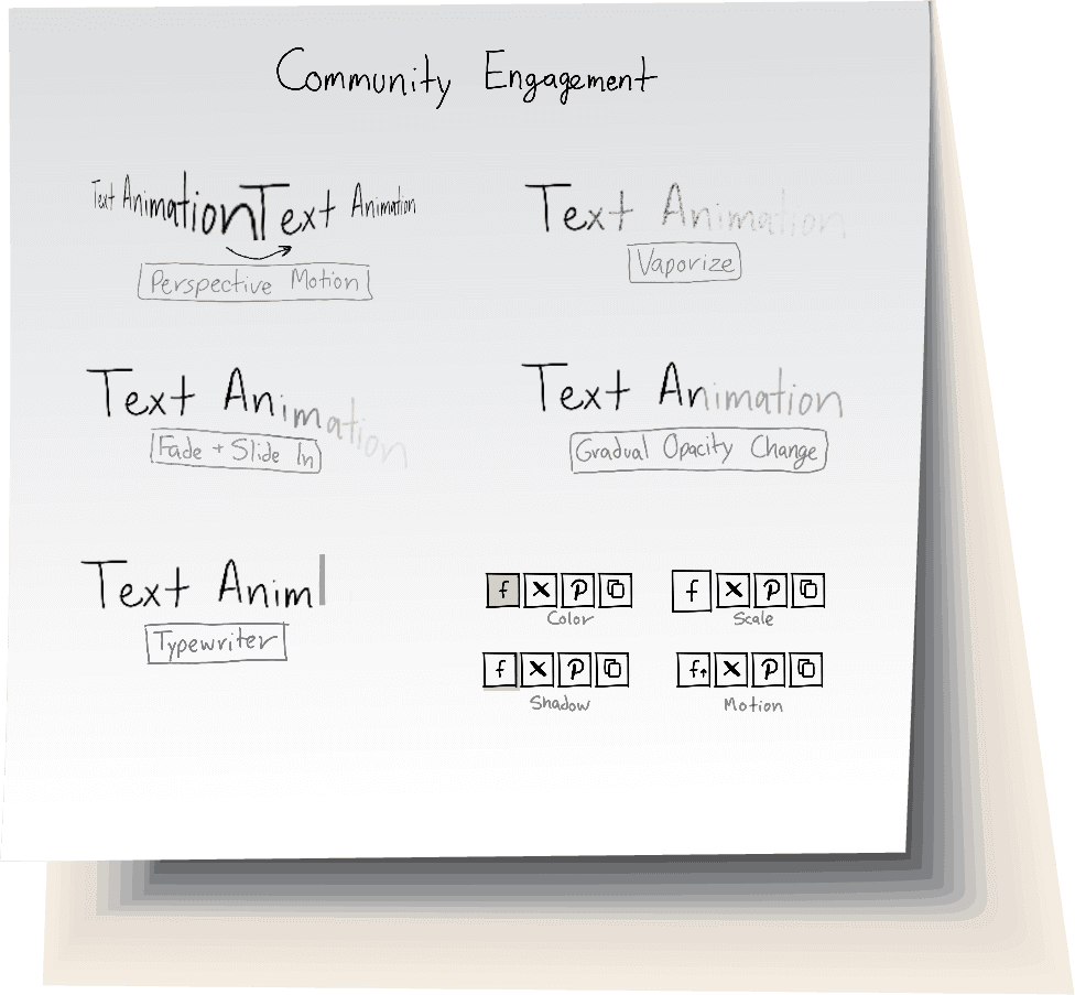
Ideation
Sketches
Design & Prototype
Design & Prototype
Design & Prototype
Design & Prototype
In the design and prototyping phase, I translated our research-driven ideas into interactive, user-centered components that addressed the needs identified in earlier phases. Many of our users emphasized the importance of responsive design, clear feedback, and engaging navigation, and each design decision was made with those goals in mind.
In the design and prototyping phase, I translated our research-driven ideas into interactive, user-centered components that addressed the needs identified in earlier phases. Many of our users emphasized the importance of responsive design, clear feedback, and engaging navigation, and each design decision was made with those goals in mind.
In the design and prototyping phase, I translated our research-driven ideas into interactive, user-centered components that addressed the needs identified in earlier phases. Many of our users emphasized the importance of responsive design, clear feedback, and engaging navigation, and each design decision was made with those goals in mind.
In the design and prototyping phase, I translated our research-driven ideas into interactive, user-centered components that addressed the needs identified in earlier phases. Many of our users emphasized the importance of responsive design, clear feedback, and engaging navigation, and each design decision was made with those goals in mind.
For the navigation menu, I implemented hover animations where links underline to guide interaction, the club name changes color for visual feedback, and the adjacent logo spins horizontally to create a sense of liveliness and brand identity. This directly addressed our goal of creating a more intuitive and engaging browsing experience.
For the navigation menu, I implemented hover animations where links underline to guide interaction, the club name changes color for visual feedback, and the adjacent logo spins horizontally to create a sense of liveliness and brand identity. This directly addressed our goal of creating a more intuitive and engaging browsing experience.
For the navigation menu, I implemented hover animations where links underline to guide interaction, the club name changes color for visual feedback, and the adjacent logo spins horizontally to create a sense of liveliness and brand identity. This directly addressed our goal of creating a more intuitive and engaging browsing experience.
For the navigation menu, I implemented hover animations where links underline to guide interaction, the club name changes color for visual feedback, and the adjacent logo spins horizontally to create a sense of liveliness and brand identity. This directly addressed our goal of creating a more intuitive and engaging browsing experience.

© RU Submissions. 2025


© RU Submissions. 2025
View Desktop Navigation and Footer on a Larger Screen
To create a strong first impression, I animated the homepage header image to rotate into position on load — a design choice informed by our research on visual hierarchy and scroll behavior.
To create a strong first impression, I animated the homepage header image to rotate into position on load — a design choice informed by our research on visual hierarchy and scroll behavior.
To create a strong first impression, I animated the homepage header image to rotate into position on load — a design choice informed by our research on visual hierarchy and scroll behavior.
To create a strong first impression, I animated the homepage header image to rotate into position on load — a design choice informed by our research on visual hierarchy and scroll behavior.
Below it, a scroll-reactive "Bismillah" strip was added, subtly moving based on scroll direction to maintain interest without overwhelming the user.
Below it, a scroll-reactive "Bismillah" strip was added, subtly moving based on scroll direction to maintain interest without overwhelming the user.
Below it, a scroll-reactive "Bismillah" strip was added, subtly moving based on scroll direction to maintain interest without overwhelming the user.
Below it, a scroll-reactive "Bismillah" strip was added, subtly moving based on scroll direction to maintain interest without overwhelming the user.
﷽
✦
﷽
✦
﷽
✦
﷽
✦
﷽
✦
﷽
✦
﷽
✦
﷽
✦
﷽
✦
﷽
✦
﷽
✦
﷽
✦
﷽
✦
﷽
✦
﷽

✦
✦
✦
✦
✦
✦
✦
✦
✦
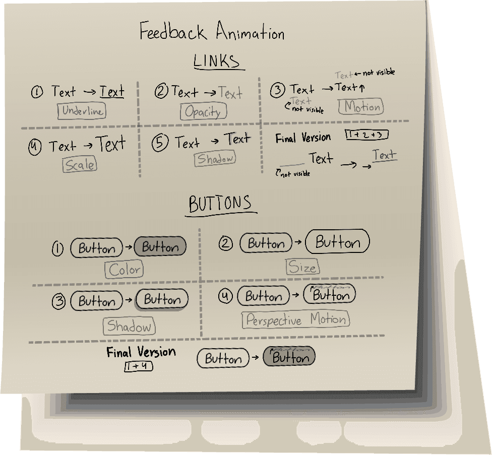
Call-to-action buttons throughout the site were enhanced with hover animations, including color changes and text flips, providing immediate visual feedback.
Call-to-action buttons throughout the site were enhanced with hover animations, including color changes and text flips, providing immediate visual feedback.
Call-to-action buttons throughout the site were enhanced with hover animations, including color changes and text flips, providing immediate visual feedback.
Call-to-action buttons throughout the site were enhanced with hover animations, including color changes and text flips, providing immediate visual feedback.
Hover Here
Hover Here
Hover Here
Hover Here
Hover Here
Hover Here
Hover Here
Hover Here
Hover Here


The subscription section was given a check animation on successful submission, reassuring users and reinforcing the feeling that their action was received.
The subscription section was given a check animation on successful submission, reassuring users and reinforcing the feeling that their action was received.
The subscription section was given a check animation on successful submission, reassuring users and reinforcing the feeling that their action was received.
The subscription section was given a check animation on successful submission, reassuring users and reinforcing the feeling that their action was received.
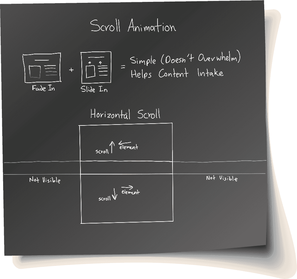
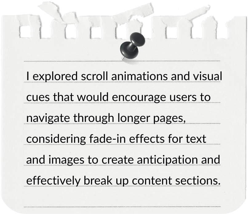
For content-heavy pages like About and Contact, I implemented scroll-triggered animations for text and images to break up dense information and improve content flow — directly addressing the concern identified in our analysis that some users feel overwhelmed by long pages of static text.
For content-heavy pages like About and Contact, I implemented scroll-triggered animations for text and images to break up dense information and improve content flow — directly addressing the concern identified in our analysis that some users feel overwhelmed by long pages of static text.
For content-heavy pages like About and Contact, I implemented scroll-triggered animations for text and images to break up dense information and improve content flow — directly addressing the concern identified in our analysis that some users feel overwhelmed by long pages of static text.
For content-heavy pages like About and Contact, I implemented scroll-triggered animations for text and images to break up dense information and improve content flow — directly addressing the concern identified in our analysis that some users feel overwhelmed by long pages of static text.


Note: About page content updated by the new team, but the
original interactions remain intact.
Note: About page content updated by the new
team, but the original interactions remain intact.
Note: About page content updated by the new
team, but the original interactions remain intact.
Note: About page content updated by the new team, but the
original interactions remain intact.
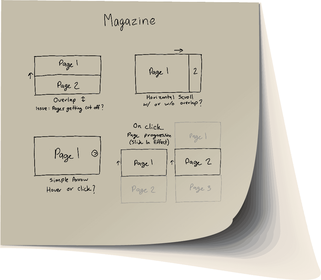
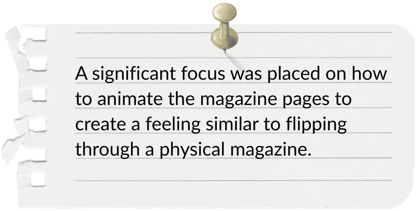
The Magazine Edition page presented a unique challenge. To maintain the feel of flipping through a physical publication — a key design goal from our ideation phase — I used a horizontal scroll layout. This preserved content integrity while offering an engaging, fluid reading experience.
The Magazine Edition page presented a unique challenge. To maintain the feel of flipping through a physical publication — a key design goal from our ideation phase — I used a horizontal scroll layout. This preserved content integrity while offering an engaging, fluid reading experience.
The Magazine Edition page presented a unique challenge. To maintain the feel of flipping through a physical publication — a key design goal from our ideation phase — I used a horizontal scroll layout. This preserved content integrity while offering an engaging, fluid reading experience.
The Magazine Edition page presented a unique challenge. To maintain the feel of flipping through a physical publication — a key design goal from our ideation phase — I used a horizontal scroll layout. This preserved content integrity while offering an engaging, fluid reading experience.
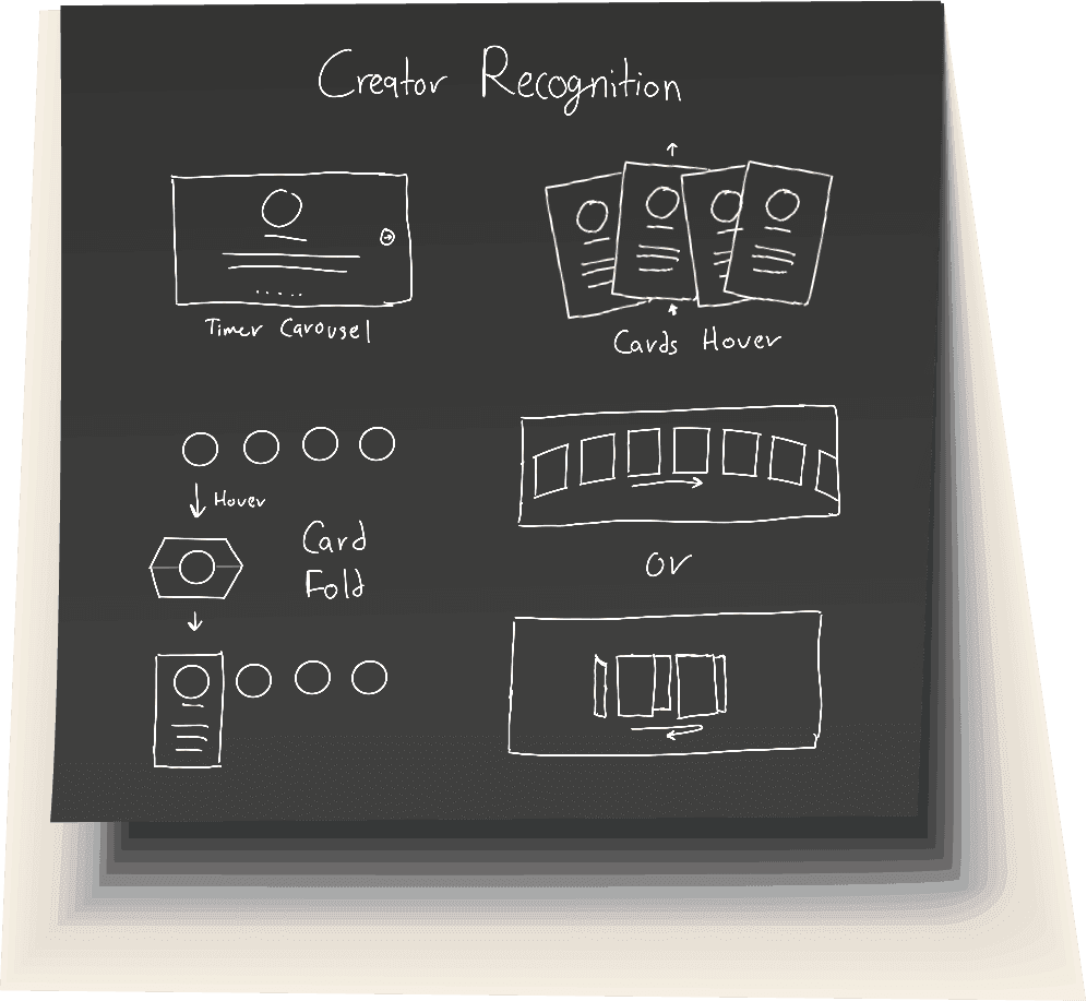
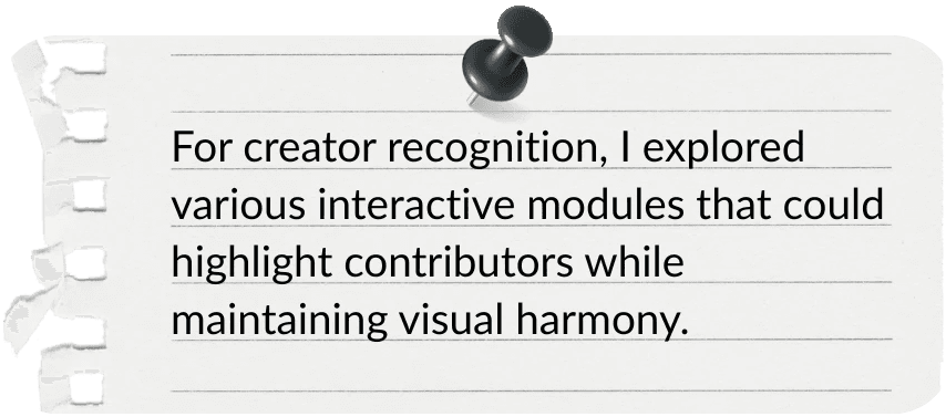
To address the need for creator recognition, I added a Featured Creators component beneath each edition—a looping 3D carousel that showcases contributor socials and encourages user exploration.
To address the need for creator recognition, I added a Featured Creators component beneath each edition—a looping 3D carousel that showcases contributor socials and encourages user exploration.
To address the need for creator recognition, I added a Featured Creators component beneath each edition—a looping 3D carousel that showcases contributor socials and encourages user exploration.
To address the need for creator recognition, I added a Featured Creators component beneath each edition—a looping 3D carousel that showcases contributor socials and encourages user exploration.
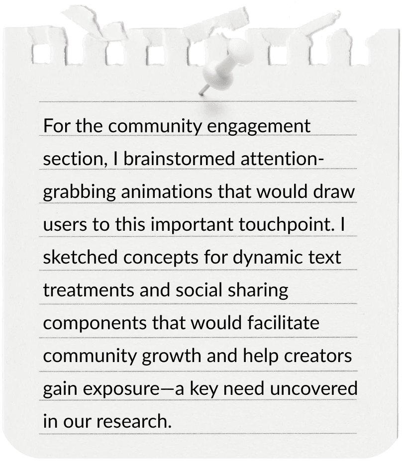
Below this, I added a Join Our Community section to encourage continued engagement. A typewriter animation on the headline draws attention, while the adjacent social sharing feature helps contributors amplify the edition—supporting exposure needs identified in research.
Below this, I added a Join Our Community section to encourage continued engagement. A typewriter animation on the headline draws attention, while the adjacent social sharing feature helps contributors amplify the edition—supporting exposure needs identified in research.
Below this, I added a Join Our Community section to encourage continued engagement. A typewriter animation on the headline draws attention, while the adjacent social sharing feature helps contributors amplify the edition—supporting exposure needs identified in research.
Below this, I added a Join Our Community section to encourage continued engagement. A typewriter animation on the headline draws attention, while the adjacent social sharing feature helps contributors amplify the edition—supporting exposure needs identified in research.
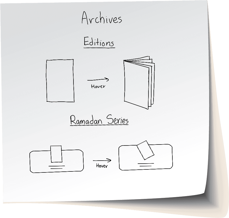
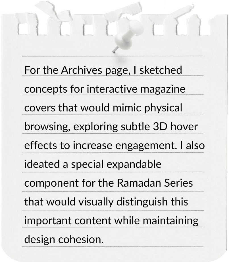
On the Archives page, to encourage exploration of past issues, I developed a 3D hover interaction where magazine covers subtly open on hover, inviting users to browse and engage in a playful way. Alongside these, I added a dedicated component for the Ramadan Series that expands upward with a gently rotating Quran illustration on hover, inviting exploration of the special series.
On the Archives page, to encourage exploration of past issues, I developed a 3D hover interaction where magazine covers subtly open on hover, inviting users to browse and engage in a playful way. Alongside these, I added a dedicated component for the Ramadan Series that expands upward with a gently rotating Quran illustration on hover, inviting exploration of the special series.
On the Archives page, to encourage exploration of past issues, I developed a 3D hover interaction where magazine covers subtly open on hover, inviting users to browse and engage in a playful way. Alongside these, I added a dedicated component for the Ramadan Series that expands upward with a gently rotating Quran illustration on hover, inviting exploration of the special series.
On the Archives page, to encourage exploration of past issues, I developed a 3D hover interaction where magazine covers subtly open on hover, inviting users to browse and engage in a playful way. Alongside these, I added a dedicated component for the Ramadan Series that expands upward with a gently rotating Quran illustration on hover, inviting exploration of the special series.
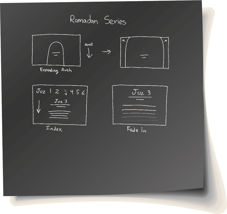
For the Ramadan Series page — one of our longest — I designed an expanding arch animation to reveal the edition cover and included a smooth-scroll index for intuitive navigation between sections. This was a direct response to our research insight that users will scroll through long pages if visual cues and interaction help guide the journey.
For the Ramadan Series page — one of our longest — I designed an expanding arch animation to reveal the edition cover and included a smooth-scroll index for intuitive navigation between sections. This was a direct response to our research insight that users will scroll through long pages if visual cues and interaction help guide the journey.
For the Ramadan Series page — one of our longest — I designed an expanding arch animation to reveal the edition cover and included a smooth-scroll index for intuitive navigation between sections. This was a direct response to our research insight that users will scroll through long pages if visual cues and interaction help guide the journey.
For the Ramadan Series page — one of our longest — I designed an expanding arch animation to reveal the edition cover and included a smooth-scroll index for intuitive navigation between sections. This was a direct response to our research insight that users will scroll through long pages if visual cues and interaction help guide the journey.
Throughout the prototyping process, I continuously iterated based on team feedback and informal user testing, ensuring that our interactive elements enhanced clarity, responsiveness, and enjoyment — without compromising usability or accessibility.
Throughout the prototyping process, I continuously iterated based on team feedback and informal user testing, ensuring that our interactive elements enhanced clarity, responsiveness, and enjoyment — without compromising usability or accessibility.
Throughout the prototyping process, I continuously iterated based on team feedback and informal user testing, ensuring that our interactive elements enhanced clarity, responsiveness, and enjoyment — without compromising usability or accessibility.
Throughout the prototyping process, I continuously iterated based on team feedback and informal user testing, ensuring that our interactive elements enhanced clarity, responsiveness, and enjoyment — without compromising usability or accessibility.
Outcomes & Lessons
Outcomes
& Lessons
Outcomes & Lessons
Outcomes & Lessons
This project provided valuable learning opportunities in several areas.
This project provided valuable learning opportunities in several areas.
This project provided valuable learning opportunities in several areas.
This project provided valuable learning opportunities in several areas.
Working with complex projects reinforced the importance of clear role assignments, enabling effective team collaboration throughout the design process.
Role Definition
I discovered how small interactive components enhance user engagement, balancing these elements with content focus for a cohesive experience.
Interactive Elements
Ensuring interaction consistency across devices highlighted the necessity of comprehensive testing and adaptive design approaches.
Device Compatibility
The project demonstrated how critical performance considerations are when implementing interactive designs for content-rich publications.
Performance
The resulting Muslim Mosaic platform successfully provided a new showcase for Muslim artists and writers while establishing a foundation for future content growth.
The resulting Muslim Mosaic platform successfully provided a new showcase for Muslim artists and writers while establishing a foundation for future content growth.
The resulting Muslim Mosaic platform successfully provided a new showcase for Muslim artists and writers while establishing a foundation for future content growth.
The resulting Muslim Mosaic platform successfully provided a new showcase for Muslim artists and writers while establishing a foundation for future content growth.
See It in Action
See It in Action
See It in Action
See It in Action
Witness how thoughtful interaction design transformed a low-traffic blog into an immersive digital magazine showcasing the creative works of Muslim artists and writers.
Witness how thoughtful interaction design transformed a low-traffic blog into an immersive digital magazine showcasing the creative works of Muslim artists and writers.
Witness how thoughtful interaction design transformed a low-traffic blog into an immersive digital magazine showcasing the creative works of Muslim artists and writers.
Witness how thoughtful interaction design transformed a low-traffic blog into an immersive digital magazine showcasing the creative works of Muslim artists and writers.
Explore Further
Explore Further
Explore Further
Explore Further
Discover additional branding and visual design work created for Submissions beyond the website project.
Discover additional branding and visual design work created for Submissions beyond the website project.
Discover additional branding and visual design work created for Submissions beyond the website project.
Discover additional branding and visual design work created for Submissions beyond the website project.